Common UI elements
A lot of these elements have states... on/off, opened/closed, etc.
- Buttons
- Checkboxes
- Radios
- Text inputs
- Pagination
- Tables
- Navigation
- Lists
- Progress bars
- Alerts
- Modals
- Etc.

A workshop with Mark Geyer
Wednesday, November 12, 2014
Here are the slides:
markgeyer.com/pres/the-art-of-ui-animations


Knowledge of HTML and CSS
Some JavaScript helps,
but it's not required ☺
A keen eye
By nature, we problem solve and connect patterns.
We all want to understand.
It's already on the screen, why reintroduce it?
A lot of these elements have states... on/off, opened/closed, etc.
We typically see these as static layouts, going from one to the next...
... instead, try to reuse view elements to become other views ☺ This takes a bit of planning.

Google Material design > Meaningful transitions > Visual continuity
If content is Batman, then everything else is Robin.

User
(Mark)
Content
(Batman)
Everything else
(Robin)Animations should be quick and always help promote content.
Where possible, make it magical.
You'll have to figure this out ☺
Position
Scale
Rotate
Origin
Opacity


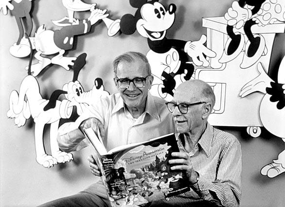
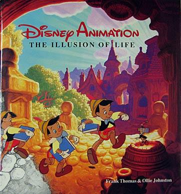
Printed in 1981; 489 pages.
Squash and stretch
Anticipation
Staging
Straight ahead action and pose to pose
Follow through and overlapping action
Slow in and slow out
Arcs
Secondary action
Timing
Exaggeration
Solid drawing
Appeal

Adds a bit of realism to an otherwise static interface.
Example:


A subtle hesitation before the main movement.
Example:


Block out states of what you're animating.
This is good planning.
Example:


Moving past the elements destination and coming back.
Example:


Movement that helps get your attention.
Example:


A natural movement with more frames
at the start and end of a movement.

Consistent and predictable motion of your product.
Example:


Surrounding elements that play off of the main movement.

Be quick about it. This takes some practice.


Shoot work that you give developers
Worked with one of our iOS devs:

Some publisher specs

AFX animation

The AFX animation

What was delivered

Same AFX file, different composition
Worked with another awesome iOS dev:

The flow aka a storyboard ☺

The AFX animation

The AFX animation

What was delivered

Posted to dribbble
User agent, external, internal, and inline styles.
Lays out the geometry of each element to the page.
Redraws visual effects and altered pixel geometry.
Jank - A transition or animation that looks jittery or janky.
Yo son... that animation looks jank!
When everything is ready, the page is composited together.
This all happens very very fast...
Only two properties are required for a CSS transition.
The other two properties are optional
(transition-delay and transition-timing-function).
You could breakout everything:
.my-button {
  transition-property: transform; /* opacity, etc. */
  transition-duration: 1s; /* 200ms */
  transition-timing-function: ease; /* ease-in, ease-out, ease-in-out,
    linear, and cubic-bezier */
  transition-delay: 2s; /* 200ms */
}
or do shorthand:
.my-button {
  transition: transform 1s 2s;
}
Since transitions and animations must have a beginning and end,
cubic-bezier will give you the best unique motion.
.my-button {
  transition: transform 1s 2s cubic-bezier(0,.5,.5,1);
}Give the browser a heads up by listing CSS
properties that will more than likely change.
.my-button {
  will-change: transform, opacity;
}
No more translateZ(0) or translate3d(0,0,0) hacks ☺
You'll want to stick to transitioning
transform and opacity as much as possible.
Altering anything else can be costly at a larger scale.
Transitioning layout properties creates
browser paint and composite issues.
Add transition properties to these form elements.
Transforms can seem complicated at first, so start
with altering translate, rotate, and scale.
With transforms, you can alter anything!
.my-box {
  width: 288px;
  height: 250px;
  color: #3d3d3d;
  background-color: white;
  border-radius: 5px;
  transform: translate(0,-30px) rotate(30deg) scale(.8);
}
							.other-transforms {
  transform: none;

  transform: translate(12px, 50%);
  transform: translateX(2em);
  transform: translateY(3in);
  transform: translateZ(2px);
  transform: translate3d(12px, 50%, 3em);

  transform: scale(2, 0.5);
  transform: scaleX(2);
  transform: scaleY(0.5);
  transform: scaleZ(0.3);
  transform: scale3d(2.5, 1.2, 0.3);

  transform: rotate(0.5turn);
  transform: rotateX(10deg);
  transform: rotateY(10deg);
  transform: rotateZ(10deg);
  transform: rotate3d(1, 2.0, 3.0, 10deg);

  transform: skewX(30deg);
  transform: skewY(1.07rad);

  transform: matrix(1.0, 2.0, 3.0, 4.0, 5.0, 6.0);
  transform: matrix3d(1.0, 2.0, 3.0, 4.0, 5.0, 6.0, 7.0, 8.0, 9.0, 10.0,
             11.0, 12.0, 13.0, 14.0, 15.0, 16.0);

  transform: perspective(300px);
}
.my-box {
  transform-origin: 50% 50%; /* center */
}
It's just like animating the anchor point
layer property in After Effects.
Couple of things to setup for 3D:
.my-3d-box {
  transform-style: preserve-3d; /* 'flat' is the other option */
}
Then add perspective to either a parent element (multiple things in 3D):
.container {
  perspective: 1000px; /* anything between 300-1000px looks pretty good */
}
or on the element's transform (only thing in 3D):
.my-3d-box {
  transform: perspective(1000px);
}.my-3d-box {
width: 288px;
height: 250px;
color: #3d3d3d;
background-color: white;
border-radius: 8px;
transform: perspective(1000px) translate(0,0) rotateY(30deg) rotateX(-30deg);
transform-style: preserve-3d;
}Also when doing 3D stuff, depending on the effect,
backface-visibility should be used.
.my-3d-object {
  backface-visibility: visible; /* hidden */
}Anything within transforms are fair game
i.e. translate, rotate, scale, etc.
It's just a matter of browser support for the transform property.
caniuse.com/#feat=transforms2dMake these cards flip when clicking it's button.
Only two properties are required for a CSS animation.
All other properties are optional.
@keyframes is the timeline for an animation:
@keyframes my-ani {
  0% { /* Your CSS properties */ }
  50% { /* that change */ }
  100% { /* over time */ }
}
or
@keyframes my-ani {
  from { /* Your CSS properties */ }
  50% { /* that change */ }
  to { /* over time */ }
}
You could breakout everything:
.my-animation {
  animation-name: my-ani;
  animation-duration: 2s; /* 200ms */
  animation-delay: 1s; /* 100ms */
  animation-iteration-count: 2;
  animation-timing-function: ease; /* ease-in, ease-out, ease-in-out,
    linear, and cubic-bezier */
  animation-direction: normal; /* reverse, alternate, alternate-reverse */
  animation-fill-mode: none; /* forwards, backwards, both */
  animation-play-state: running; /* paused */
}
or do shorthand:
.my-animation {
  animation: my-ani 2s 1s 2 ease-in forwards;
}
Same things... you'll want to stick to
animating transforms and opacity.
Animating layout properties will
create layout, paint, and composite issues.
Setup @keyframes sets to move three shapes in random
order and have the square shape be the only shape left over.
My pass (link)
$('.my-dialog').velocity({ css properties }, { options });Options: duration, easing, queue, begin, progress,
complete, loop, delay, display, and mobileHA
Add different UI pack transitions to stagger the paragraphs and images in.
UI pack usage: Faster UI animations with velocity.js
:( Great... another tool to learn.
:| Oh, that's cool.


data (JSON)
HTML5
JS


Quick walkthrough of the interface-animations repo:
github.com/markgeyer/interface-animations
It's awesome for creating polished motion ideas.
Allows you to not be bound to any technical limitations.

Check out this interview on with our very own Adrian Rapp.
He's amazing btw!

It's quick and easy.

Tried it... was kind of hard to pick up :-/
Learn Quartz Composer & Origami through Video
Might want to look at Form instead: relativewave.com/form.html
Great tool for native based prototyping.
by Ollie Johnston and Frank Thomas
by Kirupa Chinnathambi
by Tony Parisi
by Mike Rundle
Sometimes ☺
Mark Geyer - markgeyer.com
This presentation:
markgeyer.com/pres/the-art-of-ui-animations